Skip navigation

Tiffany Stappler: http://tiffanystappler.blogspot.com

Elbot Carman: http://chilledlobster.blogspot.com

Adam Ottavi Schiesl: http://adamottavi.wordpress.com/2010/04/30/eight-recent-works-on-paper/

Gail Priday: http://alwaysarting-colorcolorcolor.blogspot.com/search/label/Advanced%20Drawing%20605

Eric Hendersonhttp://midewinini-awesomeart.blogspot.com

Eric Prowkerhttp://advanceddrawingblogspring2010.blogspot.com/

Jessica Pena: jrpena0707.blogspot.com

Jessica Zaydak: J2L19Z.wordpress.com

Amanda Cobb: amandamcobb.wordpress.com

Alfred Mendoza: alfreddmendoza.blogspot.com

Heidi Morelheidimorel.blogspot.com

Colleen Morey: csmorey.wordpress.com

Lora Janneck: loleprojekts.wordpress.com

Carolene Coon: carolenecoon.wordpress.com

Kelly McCarthy: kellysart.wordpress.com

Erin Anderson: erinaanderson.blogspot.com


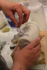
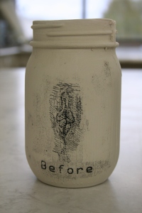
Just as I decided that paper was not too bad, Laura rocked my world by introducing the xerox lithography process on fresh, wet, greenware. Eric Henderson, Erin Anderson and I were salivating as Laura was showing us the techniques during class. It is very similar to the xerox lithography that you would use in printmaking.

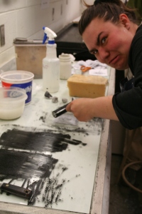
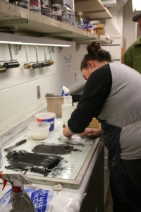
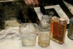
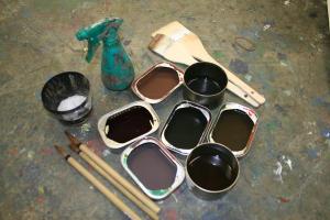
To begin, you need gum Arabic, black iron oxide/black mason stain, linseed oil, cotton balls, a printmaking brayed and some paper towels. Have some black and white xerox. Avoid greys in your images. Mix up some gum Arabic and water, till it gets soupy. You need to create your own ink, so mix up some stain of your choice and linseed oil, till it gets mucky.


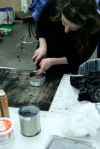
Prepare your xerox by dousing it in gum Arabic. This chemical repels the stain/linseed oil when soaked in the xerox paper. Ink up the plate enough where you can see the ink is on the black and is repelled from the white of your image. If needed, as some additional gum Arabic to ensure that the white areas are safe and clean. Erin is quite malicious when it comes to inking up clean lines.

When printing on clay. you need to make sure that the clay surface is free from texture and grog. You also want the clay to be soft and wet. Too dry, and the ink does not stick to the surface of the clay. Too wet, and the clay sticks to the plate. Either way, it can turn into a sticky situation.

This is where the magic happens. I know, you are on the edge of your swivel chair wanting to know what comes next. And honestly, you have to wait for the plate to dry up. If the xerox goes on too wet, it transfers it’s moisture to the clay body and then we run into problem. When all the gum Arabic beads dry up, pick up the plate and press it onto the clay. You can either use your hand, spoon, or rubber rib to press the inked image on your clay piece. Last step is peeling away the plate to reveal the inked clay. If things went seriously wrong somewhere down the line, you can simply rib the stain off the clay and start over.

I think this is a great process that Eric, Erin, and I have all gravitated towards. I find it interesting how different the three of us and Laura print on our pieces.

http://www.marylandprintmakers.org/newsletter.asp?id=131

http://margaretryall.blogspot.com/2009/08/paper-lithographygum-arabic-transfers.html

Xerox Lithography on Clay:  http://printandclay.net

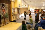
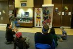
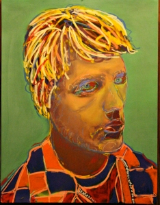
We finished critique tonight with Gail, Kelly, Elbot and Jessica Pena.  All four students had excellent life-sized self portraits and sub-genre of choice drawings.  It’s really a treat to see each student’s unique take on these assignments.  I would like to give specific attention to Gail’s fabulous genre of choice – breast feeding – AND her resulting genre of choice drawing.  The color work, perspective, concept, and execution are exquisite.

Gail's sub genre of choice drawing

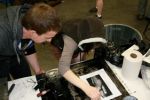
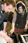
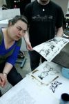
Laura also gave the class a demonstration on Xerox lithography, a process she employs often in her ceramic work.  Xerox lithography, or the Xerox transfer process, involves using gum arabic, water, and lithography ink to transfer a Xeroxed image onto cold-pressed watercolor paper. The process uses a traditional print-making press and brayers. It took most students a few tries before successfully transferring his/her images. Stark b/w Xerox images work best (as in high contrast and few mid-tones). Text and black/white designs transfer quite well also.  Some students achieved excellent results!  Check out next week’s blog for more info, or click here for the Print & Clay website and instructions.

On Tuesday night we had a critique of our two assigned color drawings:  a ‘sub-genre of choice’ drawing and a life-sized self-portrait made with anime and/or fantasy in mind.

I had a hard time with both assignments for a couple of reasons.  First, I am not overly proficient with color pastels or color media in general.  To solve this problem, and upon the advice of Laura, I spent half a months rent on super deluxe pastels (Diane Townsend and UNISON) as well as nice watercolors and multiple sheets of expensive and WONDERFUL pastel card.  It’s amazing just how big of a difference quality products make when dealing with color – and specifically color pastel.   I still remember trying to blend oil pastels into cheap paper just a few years ago. What a pain.  And what a waste.  If you’re out there reading, PLEASE do yourself a favor and splurge on superior color pastels. They are handmade and will enable you to fully appreciate COLOR among many other things.

Another problem I had while working on these two color assignments was, if you can believe it, indecisiveness in choosing a ‘sub genre of choice.’  I switched my subgenre from METAL to ELIZABETHAN to PORTRAITURE all in the course of a week and a half. Sheesh. What was my problem?  I am usually the most decisive person in the room. Well, when Laura’s not around…

So I was all over the place (in my head).  And then I received some disappointing personal news.  At that point I was not only unsure of my sub-genre of choice but I was also angry, sad, and completely blind-sided by the news.  What’s a guy to do?   Refusing creative block, I returned to my roots and worked on two simple portraits of my muse Andrew.  The first drawing came out well but then I ruined it by spraying bleach on the surface (to provide some kind of paper treatment).  I had no choice but to start over…

The second time around, I used as much pastel as I could.  It felt excessive, rich, luscious, and totally artful.  I rubbed each beautiful, rich stroke vigorously with my fingers and palms. The pastel card just lapped it up.  It was simple and yet thrilling.   I kept color theory in mind while dealing with actual color versus the pastel I was laying down.   Red then green, yellow then violet, blue then orange.

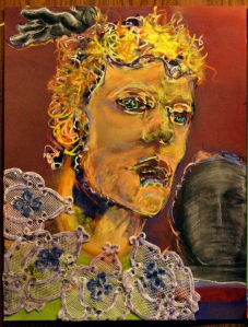
The second portrait of Andrew incorporated Elizabethan and Portraiture as my sub-genres of choice.  I turned Andrew from a prince with an exaggerated ruff, into a Greek god, and finally into a rather genderless jester all on one piece of borrowed pastel card (thanks to Jess Pena). Although each drawing below is finished, I consider them exercises in color and tenacity rather than artworks. Either way, I worked through my creative lapse and personal problems and am satisfied with the results.

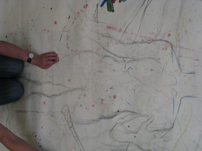
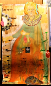
Still angry and upset, I tackled my life sized self-portrait as fantasy with the same gusto.  This time however, I used a piece of peach colored pastel card to create the face and ruff and then used various other materials and media to create the figure on the nearly 4×6 foot sheet of watercolor paper. Additionally, I placed images around and on the figure to help emphasize the fantasy aspects:  being a king/queen, being pregnant, being pissed off, being caught in a self-induced nightmare, holding the hand of a mysterious character off the page (and yet engaging with only the viewer).   I had a lot of fun with this.  Laura and I talked a bit about art as therapy.   Although I seldom consider my work to be cathartic, I admit that creating a big self portrait during a period of turmoil was incredibly and ironically relevant.

Laura started the week with a liquid frisket demonstration. Just about everyone was inspired and I imagine Dick Blick will be shipping more than a few jars to Fairbanks in the near future.
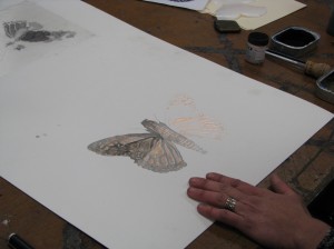
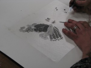
In addition to the frisket demo, we had our last sub-culture genre lecture on Fantasy/ Fantastique art. From talking to other students, I know I was not the only one inspired by the images and concepts presented. The remainder of in class time this week was dedicated to paper treatments and getting started on our life-size self portraits. This assignment was challenging on several levels. Not only did we have to come up with a concept and carry it out, but we had to figure out how to handle a 6 ft sheet of paper. Yet, as I was confident we would, we all managed to unroll it, carry it to and fro (despite it being the only 2 windy weeks of the year), find a suitable workspace and create some brilliant self portraits. I really enjoyed sharing ideas for working through this assignment with classmates and working in the Great Hall. I have always been fascinated with the creative process and really saw the process in action this week. I am a rare individual who likes math almost as much as art (I am better at art:)) and see strong similarities in the problem solving used in both. I see all art assignments as problems to be solved. There is the initial struggle, the moment where you figure out how you will proceed, and the execution, which is never without hitches. With math, you can follow several paths but do need to come up with a specific solution. With art, the struggle might be similar, but the solution can change, that is the surprise that separates the arts from other disciplines. The solution, as well as the solution path is ultimately up to the creator. This week of work time was an explosion of problems being recognized and worked through in some really exciting ways.
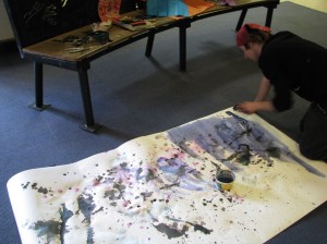
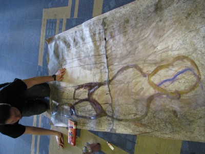
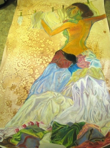
My own solution path had a rough start. I spent hours thinking, sketching and scouring the internet and books for inspiration. I had thought at first that I would go with Anime. Since so much of the Anime images I encountered were either sexual or violent I thought I would focus on violence and draw myself  beating salmon–probably the most violent thing I have ever done. I still like the concept, but Anime just was not working for me. At some point during the fantastique lecture the idea of switching from Anime to fantasy struck me. Suddenly the idea I knew I wanted to work with popped into my head. I am always more inspired to work on something when it is relevant to my life. What could be more relevant to my life at the moment than laundry? It is something I do every day–that is correct, EVERY DAY! If not, it gets completely out of control. I have tried getting rid of tons of clothes, wearing the same things over and over again, not worrying about a few small spots on the kids’ clothes, but it just keeps coming. Wet kitchen rags, filthy bibs, toilet training mishaps, dog slobber, dog hair, my two-year old getting into the dog’s water, the wood stove ashes, the potted plants, the markers etc. Not to mention the normal dirty socks, stinky shirts, sheets and towels that just need to be maintained. So I start most days in the laundry room and often end them there as well. I can recall my laundromat days–when I would read a book while sipping a latte every other week while I got 4 loads done in a few hours. How I longed for the day that I would have my very own washer and dryer so I would not have to spend an entire morning doing the wash…..sigh. The thing is, I don’t really view it as a burden. It is what it is. I like the sense of accomplishment I feel when it is all folded up and put away. I love the smell of line dried clothes. I love seeing a stain come out of something I thought had been ruined. I am domestic. I cook, clean, was dishes, feed people, wipe butts and do lots and lots of laundry. I wanted to put a positive and somewhat glamorous light on the simple mundane task of hanging out the clothes. So often images of washer women portray the woman as harsh and burdened. I thought it would be interesting to elevate the task in some way.

Designing the dress with laundry…
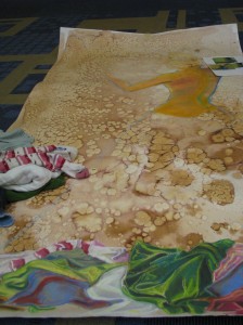
Deciding how to handle the face was a challenge. I drew several faces I was not happy with and impulsively came up with the idea of covering the face. I am not sure I should have done it. I am thinking about putting the face back in…
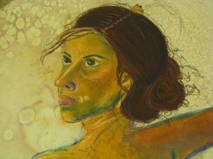
Yikes! One example of a failed face...

I am looking forward to feedback regarding the face.

I am really excited about this concept and want to continue working on this theme. Not complaining about or apologizing for where I am at the moment. Expressing the satisfaction and beauty that can come from simple tasks.
So to begin anime week, I spent a lot of time cruising around on the internet looking for inspiration for my self portrait. Unfortunately, most of what I came up with were the pages upon pages of the very formulaic approach to drawing anime and manga characters. After searching a while, I came to the conclusion that Adam’s informative lecture on the history of anime had been much more helpful than my random searching. Following this, I decided to head over to www.faceyourmanga.com to create a manga me!
unfortunately, the site had a poor hat selection and my manga head feels quite naked

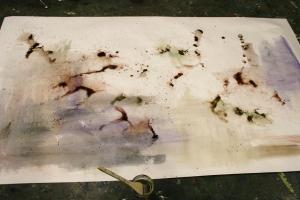
 So after having too much fun making different manga versions of my self on the different sites mentioned in class, I figured it was about time to start thinking about the assignment. Late one evening, I set up some supplies in the studio and set out to do my paper treatment. For this particular assignment, I had decided that I wanted a treatment from a variety of mellow colors and neutrals. Using acrylic inks and watercolors I got several small cans and mixed up several colors using strictly complementary colors.

ready to go with some mixed inks and watercolors

So I began with wetting my paper down and started to brush on some areas of color (like so)

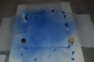
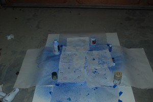
However, I’ve never been the patient type and brushing the color on was not quite working for me. Ideally, I would have like to have been able to have several small spray bottles for each color, but since this wasn’t the case, I began pouring color on (like so!)

after much color-pouring

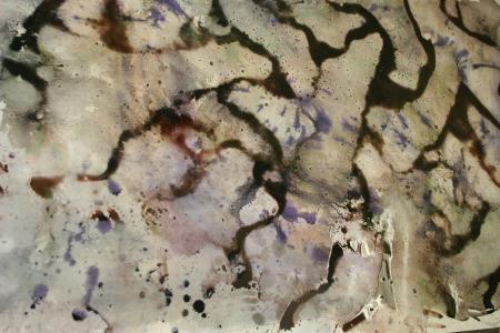
my finished paper treatment

Prior to color-splashing, I had mixed and tested each color. Having been satisfied with each color I then proceeded to work on the treatment. I was surprised to find that in one of the colors I mixed something had gone terribly wrong. Whether I did not mix it well enough or the purple just settled is unclear, but it ended up leaving purple splotches all over the place! This made me sad, because I am not a fan of purple. Fortunately, I am open minded and although my paper treatment did not end up nearly as awesome as I had planned, I will make it work.

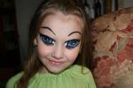
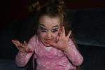
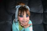
The following day, my girls and I decided to have some fun and we did manga-makeovers. Since they are always cranky with me for having to do so much homework, this was a good opportunity for them to get involved.


 The girls and I had a lot of fun with some internet pictures for dress-up inspiration and a bit of Graftobian face paint. All that is left to do now is to actually complete the assignment!


I picked new age for this project.  New age artists tend to capture a spiritual experience in imagery.  I had planned on meditating to come up with an idea, but after consuming a little vodka, I took the dog for a walk instead.  On the way home, I saw an unusual alignment with the moon and mars.  The trees were also interesting and appeared lung-like with some atmospheric variation around them. This is what I am attempting to create in this project.  Sorry, no photo of the astrological event.

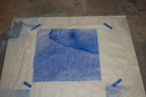
Did a loose masking of the area I wanted to treat on the paper.
I applied a watercolor and acrylic wash with a spray bottle.

It was a bit watery so I blotted it with paper towels.

The use of a hair dryer helped speed up the drying process and drove the paint around in little rivulets.

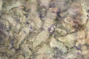
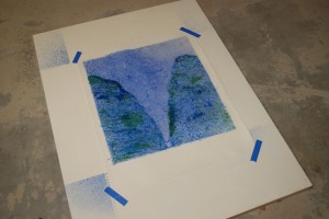
I brushed watercolor paint through an open weave fabric, blue then green.
I wanted to keep this a some what subtle, so I only painted in certain areas.

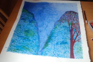
Colored pencil was used to create trees. The trees looked like lungs to me while out walking.

I’m trying to capture this with bright red and the watercolor paint applied through the fabric.

It’s still in progress and will take about another week to finish.